We’ll be at HIMSS Chicago April 18-20 🚀 Visit us at booth 7521!
- Solutions
FreeAgent CRM solutions to empower your business.
B2B Sales & Marketing
Lift your business up out of spreadsheets and email.
B2B Customer Service
Maximize your team’s efficiency and enhance customer satisfaction.
CRM for Clinics
Boost attendance rates, and maximize your referral network.
CRM for Healthcare
Connect your systems and teams in one holistic workplace.
CRM for MedTech
Accelerate operational efficiency and surface new opportunities.
CRM for Manufacturers
Connect your people, data, and processes for better outcomes.
In-House Services
Delivering lasting value from start-up to success.
- Product
Powerful, easy to use CRM your whole team will love.
Email
Supercharge your company’s most high-leverage channel for selling.Phone
Dial up the wins. Boost sales efficiency and elevate your company’s phone presence.SMS
Enjoy 95% open-rates when you add text messages to your sales toolset.Meetings
Schedule meetings faster and manage them easier.Tasks
FreeAgent helps your team stay on task.Reporting
Finally, reporting you can rely on.Automation
Spend less time on admin and have workdays full of impact.AI Assistant
Uplift your work with generative AI-powered features.
Webforms
Deploy webforms and capture data in your CRM instantly.
Integrations
Seamlessly connect FreeAgent CRM to all your favorite tools. - Pricing
- Resources
- Company
Discover the FreeAgent difference
FreeAgent is trusted by the world’s most productive teams
We design software that transforms the way teams collaborate, grow revenue and communicate with customers.
Brand Platform
Brand Platform
FreeAgent is on a mission to lead the way to a better workday.
Brand Promise
Our leadership vision is to improve peoples lives through technology.
We believe great enterprise software can bring teams closer together and help them achieve more.
Our brand is trusted by thousands of growing companies to help them collaborate, grow revenue, and delight their customers. We create user experiences that improve work-lives and propel careers.
Brand ‘Feels’
Freedom, agency, simplicity, prosper, modern, momentum, soaring eagle, “next wave”

Personality
Hi. We’re FreeAgent.
In a field of complicated and heavy CRM’s, we’re different.
We have a great personality! But, we don’t let it get in the way of our message. Most of all, we’re here to help. You’re busy. We’re experts.
And we care. FreeAgents are passionate about success. It’s more than what we do, it’s who we are.
Also, we like short sentences. Even shorter. Perfect.
Our brand goals in a nutshell
Everyone who interacts with our brand feels inspired.
Everyone who interacts with our team feels supported.
Everyone who interacts with our product feels empowered.
Logo
Main logo
The logo lockup of icon + wordmark is the most common and almost-always most appropriate usage of the logo.
Logo variations

Clear space
The logo should always be placed with enough space to ensure a powerful and clear visual image. The amount of clear space is equivalent to half the height of the mark, or 0.5y. It works both vertically and horizontally and must not be altered.

Logos on background colors
The full color logos should only be used on very light or very dark backgrounds.
Don’t use the full color logo on top of a photograph or gradient unless it sits on a very light or very dark area of the image.


- Logo in dark area stays legible

- Logo gets lost in midtones, or areas with lots of color
The parent brand one-color glyph
The full-color logo is our primary logo.
In cases where we need a single color glyph, please use only either Glacier White or Nightsky Navy for the glyph and the wordmark.

Logo assets
Dowload our logo assets, is the preferred usage for partnerships, co-branding, and in media articles.
Gradient
Solid
NightSky
Glacier
Wordmark
Wordmark Reverse
Wordmark NightSky
Wordmark Glacier
Lockup Gradient
Lockup Solid
Lockup Gradient Reverse
Lockup Solid Reverse
Lockup Solid NightSky
Lockup Solid Glacier
Color
Primary brand colors
Our primary brand colors are Growy Green, NightSky Navy, Storm Gray, Platform Gray, and Glacier White. They are used to provide accessibility, simplicity, and consistency throughout all brand communications.
Growy Green
#00B243
NightSky Navy
#121C40
Storm Gray
#7E8996
Platform Gray
#CDD6E2
Glacier White
#FFFFFF
Extended brand palette
Colors are important to our visual identity; consistency is essential. Our extended brand color palette is the foundation of our brand elements, shapes and tags. Our colors are specified as HEX/RGB colors for digital applications and as Pantone colors for print.
#121C40
R:18 G:28 B:64
Pantone 533 C
C:96 M:83 Y:42 K:47
#7e8996
R:123 G:137 B:150
Pantone 7544 C
C:57 M:37 Y:31 K:13
#cdd6e2
R:205 G:214 B:226
Pantone 538 C
C:27 M:15 Y:11 K:0
#f4f7fb
R:244 G:247 B:251
Pantone 656 C
C:16 M:8 Y:6 K:0
#00B243
R:0 G:178 B:67
Pantone 354 C
C:90 M:0 Y:95 K:0
#45B774
R:71 G:69 B:183
Pantone 7723 C
C:90 M:0 Y:95 K:0
#7FD8A0
R:127 G:216 B:160
Pantone 345 C
C:90 M:0 Y:95 K:0
#cef4d3
R:206 G:244 B:211
Pantone 621 C
C:23 M:5 Y:18 K:0
#23b8d2
R:2 G:190 B:214
Pantone 631 C
C:70 M:8 Y:20 K:0
#44E9FE
R:68 G:233 B:254
Pantone 305 C
C:55 M:0 Y:10 K:0
#bae4f8
R:186 G:228 B:248
Pantone 290 C
C:32 M:6 Y:6 K:0
#E7F5FB
R:231 G:245 B:251
Pantone 642 C
C:12 M:0 Y:2 K:0
#9c28af
R:156 G:40 B:175
Pantone 2592 C
C:60 M:85 Y:0 K:0
#e81f64
R:232 G:31 B:100
Pantone 214 C
C:11 M:98 Y:28 K:2
#e0564f
R:224 G:86 B:79
Pantone 7416 C
C:2 M:71 Y:66 K:0
#fadb40
R:18 G:28 B:64
Pantone 106 C
C:6 M:5 Y:80 K:0
#ce95d9
R:206 G:141 B:217
Pantone 257 C
C:24 M:43 Y:0 K:0
#ffa5c4
R:255 G:165 B:196
Pantone 1765 C
C:0 M:48 Y:14 K:0
#f09b9b
R:20 G:1550 B:155
Pantone 1625 C
C:0 M:47 Y:42 K:0
#f9c57b
R:249 G:197 B:123
Pantone 148 C
C:0 M:25 Y:51 K:0
Typography
Primary Font
Circular STD
Circular is a geometric sans-serif typeface with four weights—book, medium, bold and black—each with matching italics. Although the design is based primarily off geometric forms, Circular has quirks that give it a lot of warmth and make it a distinctive typeface to represent FreeAgent.
All headings and text should be in Circular whenever possible. For printed and embedded materials, Circular must be used. Contact our brand manager for licensing instructions if needed. When Circular cannot be used in web applications, use our web-safe alternative, Proxima Nova.
FreeAgents can find Circular STD font in your brand folder.

Secondary Font
Proxima Nova
Proxima Nova combines a geometric appearance with modern proportions. Available in seven weights—thin, light, regular, semibold, bold, extrabold and black—each with matching italics as well as small caps styles and condensed and extra condensed widths.
Proxima Nova is our web-safe font alternative. Use on all headlines and text only when Circular is not available (Google Docs, Slides, etc.)
FreeAgents can find Circular STD font in your brand folder.

Alternative Substitute
Roboto
Roboto is an open-source, grotesque sans-serif typeface released through Google. It renders crisply on screens and is very legible, even at smaller sizes. Roboto is the default font used in many Google Apps, hence its ubiquitousness.
If both Circular STD and Proxima Nova fonts are not available, such as the case when only linux fonts are available, then Roboto is to be used.
You can find it here.

Type Scale
Rules and guidance surrounding the type scale.
Emphasis periods
Rules and guidance surrounding emphasis periods.
Brand System
Foundation elements
Our graphic system was developed with the dot pixel or cell in mind. This is also how our graphic system should be thought of; a light, free and organic system. The graphic system is used to ensure consistency across all marketing and communication materials. It is a dynamic and flexible system, where the FreeDot is the central element from where the other elements evolve.

The FreeWing
Another important element is the FreeWing. It is a secondary evolution of the FreeDot. Each side of the FreeWing should keep the 100% Corner Radius of the FreeDot to maintain shape coherence.
The length of the wing can be freely adjusted depending on the the type of application.

Photo & Characters

General Photostyle Guidelines
Cropping
As well as ensuring pictures work well across folds, take care not to crop people’s heads, faces or bodies in an awkward way. Try not to use crops of people, environments and architecture that become too abstract.
Overuse
Be careful not to use the same picture twice in a document or repeatedly in a series of documents unless it is specifically relevant or an intrinsic part of a campaign.
Picture box shapes
Picture boxes can be square, rectangular and circular. Different shapes that result from the combination of different FreeDot evolution shapes are encouraged.
Pictures used as fillers
Pictures should not be used merely to fill a space. If a document has a lot of white space this can often aid a layout or design and is preferred to an awkwardly shaped picture box or an irrelevant picture.
Retouching/special effects
Retouching should only be done to improve the quality of a given picture and not an opportunity for trickery. Unnecessary blurring, pixelating, skewing and stretching (particularly stretching a picture to fill a picture box) should be avoided.
Copyright
Ensure rights or permission to use are secured for all photos being used. Where appropriate, permissions should be placed next to images in use. Ensure photo usage is in line with IP laws in relevant markets.
Product Illustrations
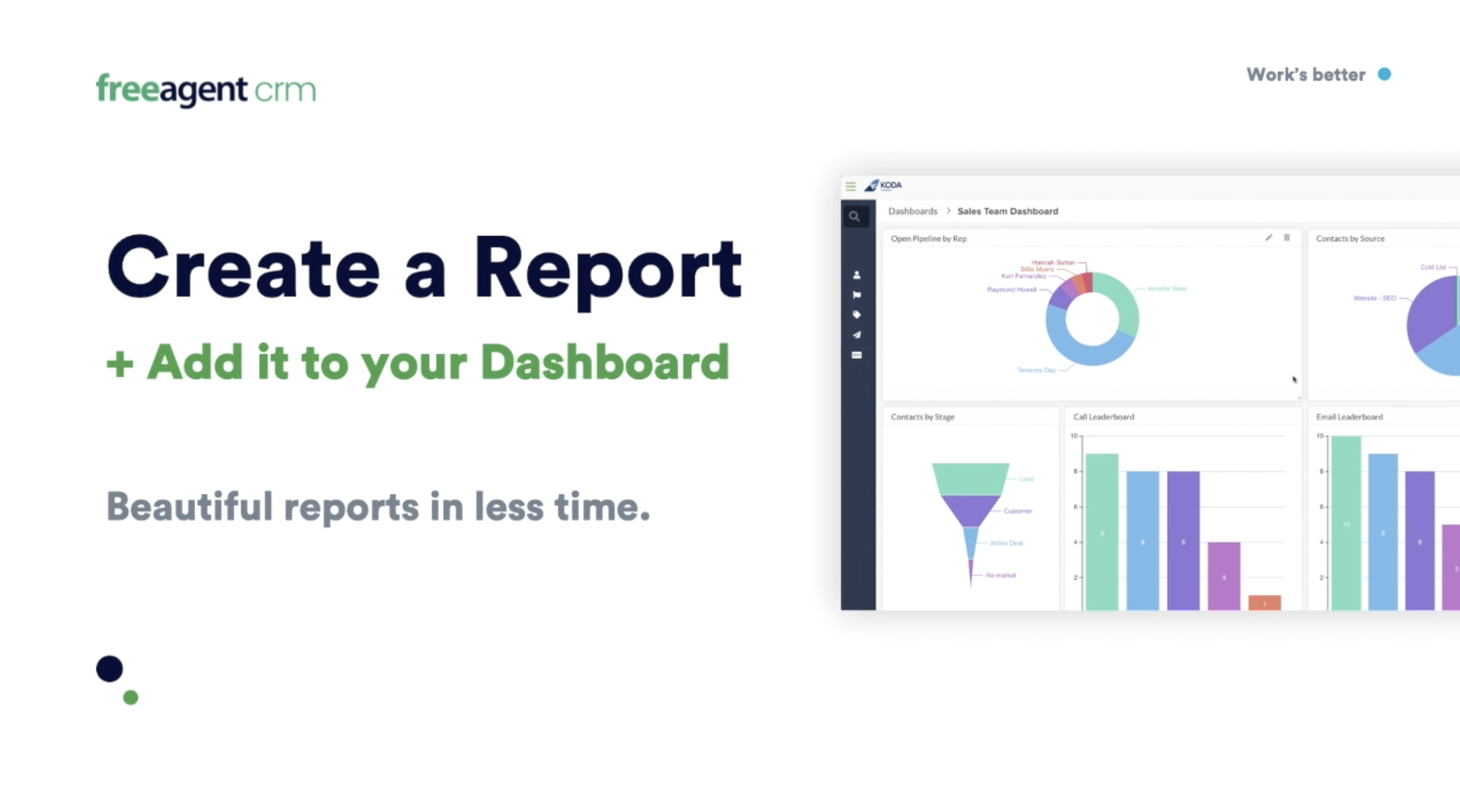
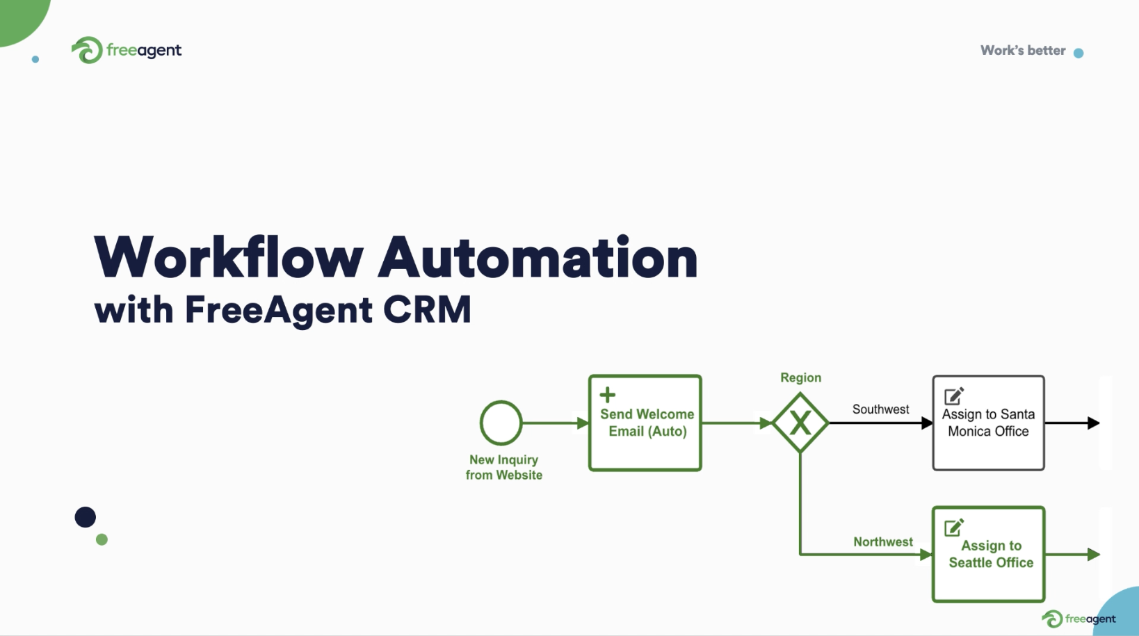
When illustrating a specific Product feature, we should include all of the Brand System elements and display the feature with consistent zoom, padding, margins and shadows.

Compound Graphics
Use an 8×8 Grid to create a dynamic device using a combination of different FreeDot evolution shapes.
There isn’t a concrete limit on the number of shapes or combinations for these compositions, but, remember that less is more and that the more balanced, the better.


Compound Graphics
Different compositions can be achieved with multiple elements. Less is usually more.


Examples
Brand System Composition
All applications, materials, advertising and graphic design pieces must be a combination of all Brand System Elements:
Logo
Grid System
FreeDot Shapes
FreeWing
Photo
Product Illustrations
Type Compositions
Color-Block Backgrounds


Lead the way
to a better workday
Talk to a CRM expert and
unleash your team’s potential.


